How to read a heatmap as a Shopify merchant
To read a heatmap on a Shopify storefront, look for five things: hot spots on elements that aren’t supposed to be clickable, cold spots on the elements you’re hoping people click, where the heat lands relative to the mobile thumb zone, how the same page differs between mobile and desktop, and how the heatmap has changed since your last theme update. Skip the rest — most of what you see is volume, not signal.
If the foundational “what is a heatmap” piece taught you what the colours mean, this one is about turning that into action. The colours aren’t the answer; the comparison between what you expected and what you’re seeing is.
The five reads that actually matter
A heatmap canvas has hundreds of points of interest. Most don’t matter. These five do.
1. Hot spots on what should be cold
The most useful read on any heatmap is the cluster you didn’t put there. Visitors tapping the product description text. Tapping a “FREE SHIPPING” badge that’s just an image. Hammering on a thumbnail expecting it to swap the hero photo.
These are expectation mismatches — the visitor’s mental model says “this is interactive” and your theme says “no it isn’t.” Every one of those clicks is friction. They cluster on the same culprits across most Shopify stores: product images that don’t zoom, “info” badges that aren’t links, accordions that look tappable on the title but only respond on a chevron icon.
The fix: either make the element do what the visitor expects, or change the styling so it doesn’t look interactive.
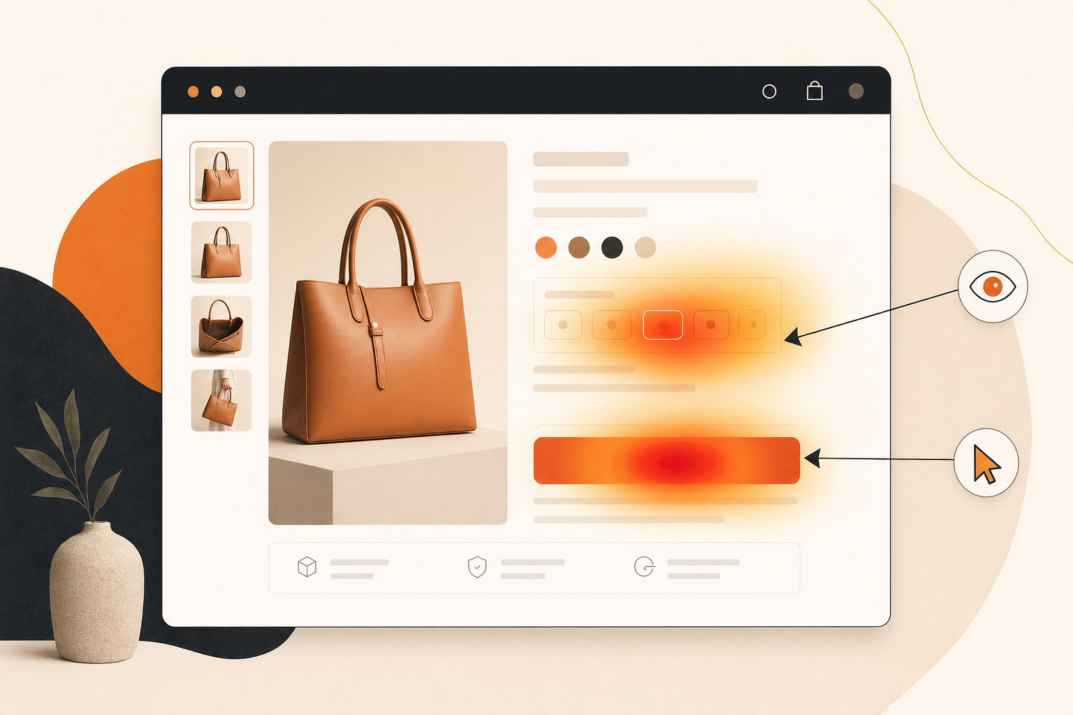
2. Cold spots on what should be hot
The mirror image, and the one merchants miss most often because cold doesn’t draw the eye. Your add-to-cart button is supposed to be the hottest thing on the PDP. Is it? Your variant selector is supposed to be second. Is it?
When the elements you’re paying for visibility on are cold, you’ve got one of three problems:
- Visibility. The button isn’t where the visitor’s eye lands. On mobile, often above the thumb zone or hidden behind a sticky header.
- Trust. The visitor sees the button but isn’t ready to click it. They want one more piece of information — return policy, size guide, delivery estimate — and your page doesn’t surface it close enough to the CTA.
- Confusion. Your CTA copy doesn’t match what the visitor thinks they’re doing. “Add to bag” vs. “Buy now” vs. “Reserve” — small wording changes make a measurable dent.
The heatmap shows the symptom; replays tell you the cause. Open three or four sessions of visitors who didn’t tap the cold CTA and you’ll usually know within ten minutes.
3. The thumb-zone vs. above-the-fold delta
Mobile is 60–80% of most Shopify traffic. On mobile, the heat doesn’t land where designers expect — it lands where thumbs reach. The bottom third of the screen, slightly off-centre toward the dominant hand, is where most clicks cluster. The top third — prime real estate for hero CTAs in desktop design — sits in an awkward zone for thumbs.
Open the mobile click heatmap on your highest-traffic PDP and ask: how much of the heat is in the bottom third? If your add-to-cart button is at the top and your heat is at the bottom, your visitors are scrolling past your CTA to get to a comfortable tap zone, then losing the page.
The fix is usually a sticky add-to-cart bar fixed to the bottom of the mobile viewport, or a duplicated CTA further down the page.
4. Comparison vs. other devices and segments
A single device’s heatmap is a story; the diff between devices is a verdict. Mobile and desktop visitors behave differently enough that you shouldn’t ever read just one. The most useful comparison move:
- Open the mobile click heatmap on the page. Note the three hottest spots.
- Switch to desktop. Note the three hottest spots.
- Look at what’s different.
You’ll typically find a hero CTA hot on desktop and ignored on mobile (hidden behind a hamburger); a variant selector clicked on desktop but barely registering on mobile (touch targets too small); a footer hot on mobile (visitors scrolling for trust signals) and cold on desktop.
These differences are where most Shopify wins live, and you only see them by flipping between the two. On Propel, heatmaps segment by device today — mobile, tablet, desktop. For deeper segmentation by customer tag or cart value, switch to recordings (which filter by every Shopify customer property) rather than slicing the heatmap a dozen ways.
5. Trends over time
A heatmap captured the day after a theme update tells you what changed. A heatmap captured 90 days in tells you what’s settling. Compare the two and you’ve got a regression test for your design decisions.
Most merchants forget to do this. You ship a new PDP layout, the heatmap looks fine in week one, you move on. Eight weeks later you’re underwater on conversion with no idea when it slipped. Snapshot week one, snapshot week eight, and the difference tells you in minutes.
(Propel’s product-page alerts catch the most aggressive version — significant drops in add-to-cart rate get flagged automatically — but a manual then-vs-now compare every time you ship a theme change is a habit that pays for itself within a quarter.)
A walked-through example: a clothing PDP
Imagine you sell mid-priced women’s outerwear. Your bestselling product page is a wool coat. Traffic is healthy, conversion has been flat for two months, and Shopify Analytics doesn’t tell you why. Here’s what a 20-minute reading session looks like.
You open the click heatmap on the bestseller PDP, mobile view. The hottest cluster isn’t the add-to-cart button. It’s the product image — a tight cluster on the hero photo and a second one on the first thumbnail.
That’s read #1. Visitors expect to tap the image and get a zoom or a carousel swap. Your theme has neither. They tap, nothing happens, they tap the thumbnail expecting it to change the hero, the hero doesn’t change. Three friction events before they’ve seen the size selector.
The size selector is lukewarm at best. It should be the second-hottest element on the page. It’s barely warmer than the product description. Read #2 — visitors aren’t getting to the size choice. Either they bounced before, or the selector is hard to use on mobile. Probably both.
Add-to-cart heat? Faint. It’s in the bottom third (good, thumb zone) but absolute volume is low. By the time visitors reach the CTA, most have given up.
Switch to desktop. Suddenly the add-to-cart button is hot. The variant selector is hot. The image clusters from mobile are almost gone — desktop visitors hover for the zoom, no click event recorded.
Read #4 — your PDP works on desktop. It’s bleeding on mobile. The layout isn’t the problem; the mobile execution is.
Action for the week: ship three changes to the mobile PDP. (1) Make the hero image tappable to open the carousel. (2) Make thumbnails swap the hero on tap. (3) Move the size selector higher.
Re-check in seven days. You expect: the hero image cluster shrinks, the size selector gets warmer, ATC heat increases. If it did, you’ve moved the page. If not, your hypothesis was wrong — go back to read #1 with fresh eyes.
That loop — read, hypothesise, ship, re-read — is what a heatmap is for.
Three misreads to avoid
Hover isn’t intent
If you’re using a movement-style heatmap (Propel doesn’t ship one yet — coming soon — but other tools do), don’t read mouse position as attention. The correlation is real but weak. People park their cursor in odd places. Use it as a soft hint, not a verdict. On mobile, where there’s no cursor, movement maps don’t apply at all.
Volume isn’t proportion
The trap that takes down the most merchants. The hottest spot is hot because it gets the most absolute clicks. But a hot spot with a 5% downstream conversion rate is worse than a lukewarm spot with a 40% rate. The heatmap shows density, not efficiency.
If a button is hot but the visitors who click it don’t end up buying, that’s not a win — it might be a leak. Heatmaps alone are blind to this. Replays plus Shopify Analytics keep you honest.
One-page heatmap isn’t a funnel
A heatmap on the PDP tells you nothing about checkout abandonment. A heatmap on the cart tells you nothing about whether visitors got there for the right reasons. Use heatmaps for page-level diagnostics, replays for the journey, Shopify Analytics for the macro funnel.
When a heatmap is NOT the right tool
Heatmaps answer one question: “what’s happening on this page that I can’t see?” They’re the wrong tool for a few neighbouring questions:
- Audience-store fit. If your traffic is wrong — paid traffic that doesn’t match your offer, organic landing on the wrong page — no amount of heatmap reading will fix it. The page might be perfectly designed for the wrong visitor.
- Checkout abandonment. Once a visitor enters Shopify’s hosted checkout, the heatmap is dark. Shopify’s own checkout analytics is the right tool.
- Multi-page journey questions. “Why don’t homepage visitors reach the PDP?” is a journey question. A homepage heatmap will hint at it; only session replays of the actual flows will tell you.
- Low-traffic pages. A heatmap with 30 sessions behind it isn’t a heatmap, it’s a sketch. Wait for 200+ sessions.
Diagnostic question: do visitors reach this page in numbers? If yes, a heatmap is your tool. If they don’t reach it, or they leave without acting, replays and analytics will serve you better.
The 15-minute heatmap audit
Once you’ve got the reads down, the workflow is fast. Run this weekly.
- Pick one page. Your highest-traffic PDP for most stores. Content-heavy stores start with the homepage. Don’t try to audit five pages — pick one.
- Open the click heatmap, mobile view.
- Note three hot spots. Any on elements that shouldn’t be clickable? That’s read #1.
- Note three cold spots. Any on an element that should be hot? That’s read #2.
- Note one surprise. Anything unexpected — an unusual cluster, an interaction pattern that doesn’t match what you assumed.
- Switch to desktop. Same five-spot exercise. Note where the heat shifts.
- Compare the two devices. What’s different? Highest-leverage fix usually lives in the diff.
- Pick the one thing. Don’t try to ship five fixes. One highest-leverage change for the week. Ship it.
- Schedule next week’s audit on the same page. Re-read. Did your hypothesis hold?
Run that loop weekly on your top page for a quarter and you’ll have a meaningfully better-converting PDP, with receipts for every change.
Closing
Heatmaps reward habit, not heroics. The merchants who get value from them aren’t studying a fancy report — they’re opening the same heatmap every week, noticing the drift, shipping a small fix. Five reads, three misreads, fifteen minutes a week.
If you don’t have a heatmap installed yet, Propel ships click and area heatmaps on every page with 0ms impact on Core Web Vitals — free up to 750 pageviews/month. Once you’ve got the reads down, the next move is pairing the heatmap with the replays of visitors who hit each cluster. The heatmap finds the anomaly, the replay tells you why.
For the broader CRO frame, the Shopify CRO guide covers what to fix in what order. If your store isn’t converting and you’re not sure where to start, this piece walks through the diagnostic.