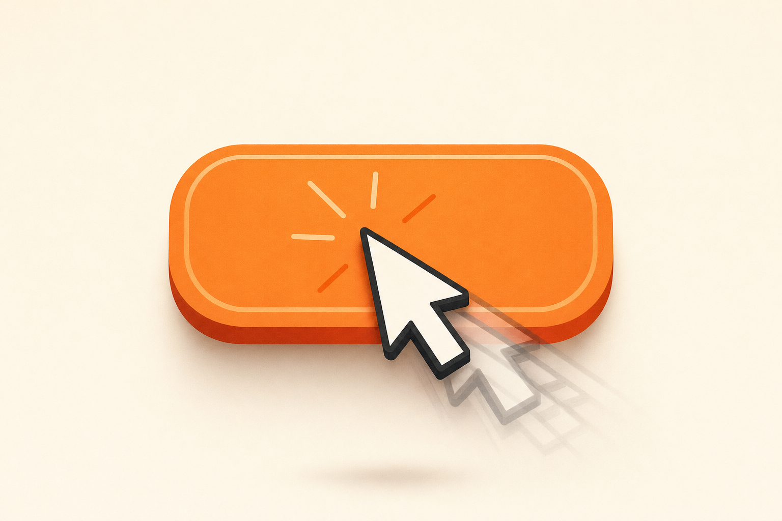
Dead Clicks & Rage Clicks: What They Mean (and How to Fix Them)
A rage click is a series of rapid repeated clicks on a single element — a frustration signal that the element didn’t respond when the visitor expected it to. A dead click is a single click on something that looks interactive but does nothing at all.
Both are your storefront talking to you. The customer thought they could move forward, the page disagreed, and the disagreement showed up as muscle memory: tap-tap-tap-tap on a button that’s spinning, or one decisive tap on a product image that turns out to be just an image. If you’ve installed session replay on your Shopify store and you’ve never gone looking for these patterns, you’re sitting on the cheapest CRO fix you’ll find this quarter.
What rage clicks tell you
Rage clicks are almost always a responsiveness problem — the element exists, it’s interactive, but the visitor’s brain has decided it’s broken. The usual suspects:
- Slow page response. JavaScript is hung, an animation is in flight, or a network request is taking longer than 800ms. The button looks pressable, the customer presses it, nothing visible happens, the customer presses again. And again. And again.
- A button that’s disabled but not visually disabled. Common with “Add to cart” on out-of-stock variants — the variant selector flips state but the CTA’s appearance doesn’t change in lockstep.
- Hover state misread as a clickable element. A card with a hover lift looks tappable on mobile (where there’s no hover, just a quick state flash). The customer taps the card body. The actual click target is only the title.
- A variant selector that needs a second tap on mobile. First tap closes a soft keyboard, second tap activates the swatch. The customer reads the gap as “broken.”
- An “Add to cart” that takes too long. Anything over a second on the AJAX cart is enough to trigger the second click. By click three you’ve probably added three of the item.
Each rage click is one customer telling you “I expected something to happen.” Stack five of them on the same element across a week and that’s a defect.
What dead clicks tell you
Dead clicks are almost always an expectation problem — the element looks interactive, the visitor acts accordingly, the page does nothing because there’s no behavior wired up.
- An image that looks zoomable but isn’t. Most ecommerce shoppers are conditioned by Amazon and Apple to expect a tap on a product photo to enlarge it. If your theme doesn’t ship lightbox or pinch-zoom, the photo is a dead click magnet.
- A block of text that looks like a heading-link but isn’t. Bold, large, brand-color, sometimes underlined on hover for SEO purposes — and not actually a link. The customer taps. Nothing.
- A card that looks tappable but the click target is only the title. The visitor aims for the largest, most obvious chunk of the card (the image, the price, the body) and hits dead air.
- An icon that looks like a button. A small chevron next to a price, a question mark next to a shipping line — visitors will absolutely tap them. If they don’t open a tooltip or a modal, they’re dead clicks.
A dead click is your customer asking a question your storefront didn’t expect.
The four most common Shopify-storefront patterns
Across thousands of Shopify storefronts, four patterns produce the lion’s share of rage and dead clicks. They’re worth knowing by name so you can recognize them in a replay without thinking.
1. Variant pickers that look like dropdowns but aren’t
Many Shopify themes render size and color as swatch buttons. Many shoppers — conditioned by Amazon, Walmart, generic ecommerce — expect a dropdown. They tap the variant label. They tap the variant container. Nothing happens because the actual click target is the swatch tile, not the label or the surrounding box. By the third tap you’ve got a rage click cluster on an area that, from the theme developer’s point of view, isn’t even a button.
The fix is usually to extend the click target to the obvious tap zone, not to redesign the swatch.
2. Slow add-to-cart (>1 second)
Shopify’s AJAX cart is fast when your theme is light and slow when your theme has eight third-party apps stacked into the cart drawer. The merchant doesn’t notice because they have a fast laptop, a fast connection, and they’re testing on a hot cache. The customer on mid-range mobile and 4G doesn’t have any of those things.
Watch a replay of a frustrated mobile customer hammering “Add to cart.” Two seconds of nothing-visible-happening is enough. The fix is sometimes a code change (debouncing the click, showing a spinner immediately) and sometimes an honest audit of which cart-drawer apps you actually need running.
3. Broken theme buttons after a theme update or a snippet edit
This is the silent killer. You push a theme update at 11pm Friday. Or a freelancer edits a snippet and forgets to test the mobile view. By Monday, conversions are quietly down and you don’t know it yet because Shopify Analytics doesn’t flag a button being unbound from its handler.
Replays catches this two ways. Product-page alerts flag the add-to-cart-rate drop on the affected PDP automatically. And rage-click detection on every replay means you can filter the list to just the sessions where someone hammered a CTA, then watch them in order. You go from “we found it Friday” to “we shipped the fix Saturday morning.”
4. Image-zoom interactions on mobile
Pinch-to-zoom expectations vs. tap-to-zoom themes is a classic mismatch. Some themes hijack pinch and require a tap to open a lightbox. Some themes do the inverse. Some themes do neither and the product image is just an image. Mobile customers will absolutely try all three gestures in five seconds before giving up.
Dead clicks on the product image are a near-universal pattern. The fix is usually small: ship a lightbox, make the gesture obvious, or visually cue tap-to-zoom with a small zoom icon.
How Replays surfaces these automatically
Propel Replays auto-detects rage clicks and dead clicks on every visitor session. You don’t tag elements, you don’t define rules, you don’t write a query — the detection is baked in.
The pattern that matters more, though, is finding the sessions where these happened without scrubbing through hundreds of replays. That’s where rage-click and dead-click filters earn their keep — narrow the replay list to only the sessions with frustration events, then watch those. The AI summary on each replay calls out the friction event in the two-sentence narrative, so you can skim a list and watch only the ten that are actually telling you something. Separately, insight alerts proactively surface the day’s biggest orders, biggest abandoned carts, and biggest abandoned checkouts so you watch what matters first when you sit down to triage.
The combination — auto-detection plus filterable replays plus AI summaries — is the difference between “we have session replay installed” and “we use session replay.” Most stores that bounce off session-replay tools bounce because nobody had time to scrub. This is the workflow fix.
The fix-it playbook
When you find a rage-click or dead-click cluster, you want the same four steps every time.
- See it. Open the replay where the pattern happened. Watch the ten seconds before and after. Note the exact element, the device, the browser.
- Confirm the pattern. Filter the replay list by the same page and the same device. Watch three more sessions. Is this one customer with a flaky connection, or is it five-plus customers in a week hitting the same wall? The latter is the defect.
- Reproduce on your own device. Try the action that broke. If you can’t reproduce it on desktop, switch to mobile, switch to the browser the customer was on, switch to a throttled connection in DevTools. Don’t skip this — most “bugs” turn out to be specific to a viewport or a network state, and the fix has to match.
- Patch and verify. Ship the fix (longer click target, faster cart response, lightbox on the image, whatever the diagnosis was). Then watch new replays the next day. The pattern should be gone or significantly thinner. If it isn’t, you fixed the wrong thing — go back to step one.
The verification loop is the part most teams skip. A fix you didn’t verify isn’t really a fix; it’s a hypothesis with a deploy attached.
What to ignore
Not every rage click is a bug. Some are customers being customers — the impatient tap, the connection-flaky double-click, the kid who got hold of the iPad. One rage click on an element is noise. Five rage clicks across five sessions on the same element is signal.
The same goes for dead clicks. A dead click on an image that looks like a link is your customer telling you to either make it a link or style it differently so it stops looking like one. That’s design feedback, not a defect — but it’s still feedback, and ignoring it costs you the same conversion as ignoring a bug.
The bar to clear is “is this pattern repeating across customers.” If yes, fix it. If no, move on. There are always more rage clicks than there are good uses of your time.
Closing
Rage and dead clicks are unusually honest data. Customers don’t lie when they’re frustrated, and they especially don’t lie when they’re frustrated with their thumb on a button at 11pm trying to give you money.
Install Propel Replays, let it sit for a week, and filter the replay list down to just the sessions with rage clicks or dead clicks. The first cluster you find usually pays for the year of the tool in a single recovered customer. If you’re still upstream of why your store isn’t converting at all, start here — rage clicks are one piece of a bigger picture.